Guest Post: PicMonkey for Pictures

Today we’re featuring another fantastic guest post, this time from Emily Thompson, Learning Technologies Librarian at SUNY Oswego.

Most libraries aren’t fortunate enough to have a professional photographer on staff, the most we can hope for is an enthusiastic amateur. While that person might know how to use Photoshop or Gimp, those programs are complicated and really require at least a basic class to figure out how to work them well. They are also slow to open, which is annoying when all you want to do is crop a photo to put up on the Facebook page.

Enter PicMonkey, a free, web-based photo editor that lets you make quick edits in a simple format. As an academic librarian, I use it primarily to jazz up our social media. An announcement is just words, but PicMonkey gives me a quick way to turn those words into a high-visibility image.

From their homepage, you have two options: Edit a photo or Create a collage.  To edit, you just have to drag your .jpg or .png to the box, and the site will open the editing page.

PicMonkey Photo Editing Site

PicMonkey Homepage

Once there, you’ll see the site’s wide array of tools. While not as precise as more professional tools, PicMonkey can fix basic problems with exposure, crop, and add filters. For example, lets look at this photo of my cat. I accidentally left the “incandescent” filter on, so this photo is a bit dark and a little blue.

PicMonkey Editor

Before…

Picture of cat after cropping

After cropping and adjusting the brightness.

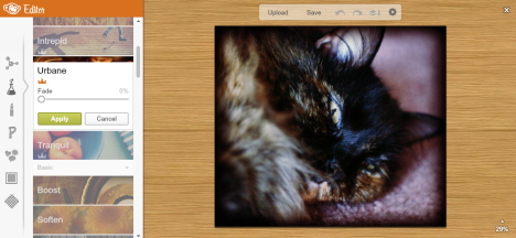
From there, I added the Urbane filter, which add some Instagram flair without the smart phone.

Cat picture after Urbane filter

Cat picture after the “Urbane” filter.

The “lipstick” icon takes you to more traditional airbrushing tools. These aren’t the strongest features, really good airbrushing does require a professional tool. However, they’re constantly improving, and they add some fun tools like “Highlights.”

After highlighting and lipstick tool.

Where PicMonkey really shines is in its selection of fonts. There are over 30 different ones, and no Comic Sans. Mac users will note that colors and size are determined in a window very similar to the Inspector from Pages.

Fun with fonts.

You can also add symbols, frames, and textures.

Add borders to finish the look.

The nice thing about all of these features is that they are easily manipulated with sliders, and nothing is permanent until you click “Apply.”

Once you’re done, click “save” and the photo will be downloaded in one of three sizes (I usually choose “Ewan” unless I think I might need to blow my photo up.)

So, now that your photo is all pretty, you can throw it up on Facebook or Twitter and call it good. However, one of the problems with social media is that albums of photos can be inconvenient, and of course, Twitter has no album at all. PicMonkey has a solution: Collage!

Just upload your photos and arrange! When you save your masterpiece, it’s downloaded as a single .jpg. Easy.

PicMonkey Collage.

A few caveats: PicMonkey is Flash-based, which mostly means that it won’t work on tablets. Also, as browsers move to HTML5, the developers will have to figure out what they want to do. Also, this site is free and it looks like they’ve decided to go with an add-supported version, but in the past the plan looked to be asking people to pay for anything with a crown. I hope the ads work out, but the non-crown features make this site well worth adding to your arsenal of tools.

Overall, nothing else will let you edit a photo as quickly. And the results look GOOD. It takes your enthusiastic amateur and makes him or her look like a pro.


Emily Thompson is the Learning Technologies Librarian at SUNY Oswego in Oswego, New York. She spends her days seeking out new tools to help her students make their projects as awesome as possible. She also co-hosts the LiTTech podcast on edreach.us. You can follow her on Twitter @librarianofdoom.

Guest Post: Using Google Fusion Tables for Address Data

Today we’re featuring a guest post by Ilana Barnes. Take it away, Ilana!

Data is out there. I would refrain from saying good data is out there, or even relevant data is out there. As Kim said, we are in the “year of the infographic,” and we are equally in the “year of the unruly excel document.” When one is lucky enough to receive large amounts of data that is relevant, they may stare down at their excel or SPS document and then say: “Now what?”

One type of data becoming increasingly accessible is addresses. More and more companies and organizations post their address online. They are aggregated up into somewhat tidy databases like RefUSA and OneSource, accessible on many college campuses and local public libraries. Once bound in the white pages, this address data is the meat of many new and exciting ways to research. With information about where companies are, you can find a great number of exciting things. For example, the location of food stores in Detroit can help you locate food deserts. The location of Targets in the United States can help you predict where next to put your big box store. I just had a chat yesterday with a professor who researches how industry is affected by natural disasters, using location-based disaster data and addresses as well as other indicators.

Working with data may not be a common task for all academic librarians, but there are a lot of possibilities once you start diving in.  As a future Business Librarian, I learned about better ways of dealing with address data because so many students were asking location-based questions. Where do I put the Walmart? Which city has the most crime and where? For those who feel a little less steady diving into data-related questions, address data can be a good, solid place to start exploring. Beyond the reference desk,  questions that librarians ask can be answered through use of address data. Where are comparable services to my library? Where are the different campuses of your university where you trying a specific information literacy strategy and where are the campuses of your partner institutions?

Sold on address data? Excellent! We’re going to go over some tools for working with address data. Firstly, if all you want to do is create a map of addresses, BatchGeo is an excellent tool for taking all those address and putting them on a Google map. You can code 150,000 address per IP per day, and create a Google map which you can then enhance using the Google interface, either drawing polygons or adding metadata. But what if you want to do some other visualizations?

Google Fusion Tables is an awesome product. Google Fusion Tables also can geocode addresses into a Google map.

Why I like Fusion Tables:

  • Different types of visualization
  • Sweet, sweet fusion. The merging capabilities of Google Fusion
  • Collaboration. You can share your data sets relatively securely via Google Fusion Tables with research partners. This is great for us librarians, who often want to work together on large, spreadsheet heavy projects.
  • You can link it up to Google Refine for those more squirrelly datasets.

Here’s an example with some roughly 300 gas stations in the city of Detroit.
Here is the data as it looks in Excel. Ugly.

Ugly data in Excel.

Here’s what it looks like geocoded (editor’s note: for an interactive version of these charts, see Ilana’s blog):

Geocoded data.

Another view (this time using some sales data as well):

Another view (more pie charty). I understand this is a terrible pie chart, but it’s very aesthetically pleasing.

Pie Chart

For a very effective run-through what makes Google Fusion Tables wonderful, check out this YouTube video from Google.


Ilana Barnes is Business Information Specialist (Assistant Professor of Library Science) at Purdue University since May 2012. In April, she graduated from the University of Michigan with a Masters of Science in Information. Her main research interests are information literacy, data, GIS and gamification. You can visit her website at http://ilanabarnes.com or follow her on Twitter, @librarianailana.